Red + Black Review: Melbourne School of Design
One of the most significant additions to Melbourne’s world class Architecture in 2014 is a building full of expectation and promise. Some buildings have more expectations on them than others. When a new school of architecture such as the new Melbourne School of Design is built the design stakes are rarely higher. Every aspect of the building will be continually measured analysed, photographed, critiqued and criticized for the life of the building.
The Melbourne School of Design is the outcome from a competition process won by John Wardle Architects (Melbourne) and NADAAA (Boston). The MSD is built upon a site of high strategic importance being centrally located within Melbourne University’s Parkville campus and surrounded by a context of large educational buildings from a variety of decades.
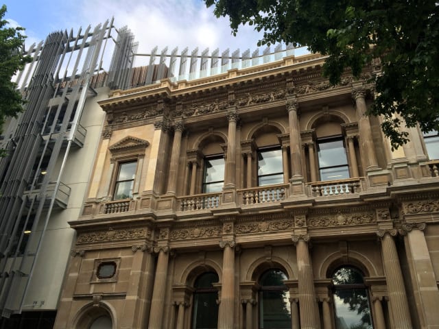
The new building replaces the previous Architecture building by Brian Lewis that was completed in 1964 and also the Old Commerce building with the exception of the historic facade.
As a side story, the historic facade of the Old Commerce building was in fact designed by one of Melbourne’s most prolific and important architects Joseph Reed. It was originally attached to the Bank of New South Wales building in Collins Street, until that building was demolished in 1932 and the facade was transplanted to the University of Melbourne site. The MSD is now the third building to be adorned with Joseph Reed’s Renaissance Revival facade.
With such high expectations what has been the result?
From the exterior this building is most defined by the curtain like facade which is crafted out of perforated zinc panels. This metallic veil is complemented by highly refined and sublimely detailed concrete panels which provide a sculpted but robust feel which is carried into the ground floor thoroughfare. It is important to note that the zinc panels are not merely decoration, they are strategically placed to work functionally as solar shading. The Architects here have resisted the temptation to create a single gesture building by continuing the veil around to the southern facade.
This southern facade may be seen as the buildings greatest weakness. The pixilated window placement and the exposed concrete panels create a very flat facade composition particularly when compared with the dynamic zinc veil. This is not to say that this is bad architecture rather that it is less potent than the rest of the building.
To some degree the subdued Southern facade is made up for by the interesting intersection between wall and landscape at ground level. A continuous glazed wall playfully evokes a fabric skirt which is having a Marilyn Monroe moment, interrupting the vertical of the wall.
If the Southern Facade is the greatest weakness, undoubtedly one of the greatest strengths is the dramatic atrium space. This has to be one of Melbourne’s very best interior spaces.
The centre piece of this architectural composition is the floating stalactite like structure which dramatically descends from the coffered ceiling. Housing a single classroom space on each level this timber sculpture is exquisite in its precision and form. The impressive timber volume hovers tantalizing close to the work space below it, inviting the occupier to reach out instinctively.
One of the more unusual design decisions within this building is the widespread use of wire mesh which clings to the periphery of the atrium. Used on mass, this wire takes on a net like character that at times seem at odds with the precision of the timber panels. The benefit of this wire is that it does not reflect sound the way a glass balustrade might. It also allows a greater felling of openness and connection from the circulation spaces to the atrium which is unparalleled in Melbourne.
Ultimately this building must be a building about learning in order to be a success. It is in this regard that the building must have it’s greatest impact.
The more formal studio spaces have been placed along the southern side of the building to get the most use from the gentle southern daylight. Vertical surfaces throughout this zone have been naturally equipped to double as pin boards to facilitate work to be displayed and reviewed. Whilst the building may not have the variety of learning spaces of say the Swanston Academic Building, there are several options for the type of spaces students can occupy.
The opportunity for students to learn from the building itself has also been a strong consideration. Structural elements at several points have been left exposed to be studied by curious observers.
A building such as this demanded excellence and it is hard to argue that this building is anything other than successful. What has been delivered is a hardworking piece of architecture which is in places exquisite and dramatic whilst at others is stripped-back and experimental. It is not a single idea but a collection of ideas to be read interpreted and analysed for years to come.
Michael Smith is Director of Melbourne architecture firm Atelier Red + Black. This article originally appeared on The Red and Black Architect blog..
