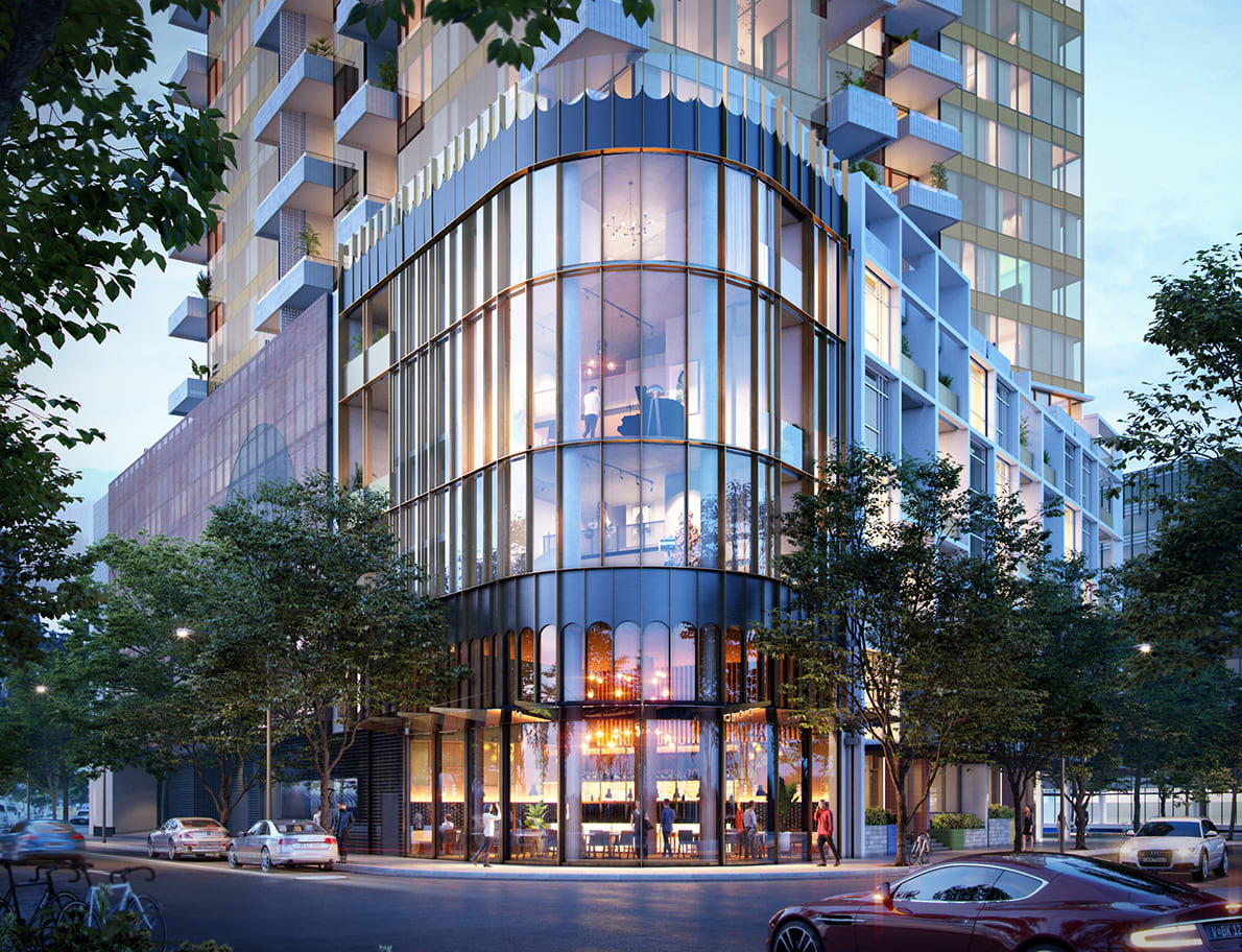
Escala NewQuay in Focus - Part Two
Following on from yesterday's Q&A with MAB's David Allt-Graham, urban.com.au today discusses the design approach to Escala in NewQuay with Six Degrees Director Mark Healy and how the office's experience in the residential sector and within Melbourne's laneways, informed the key design drivers and composition of the project's architecture.
urban.com.au: Escala represents Six Degrees jump into high-rise development. What was Six Degrees' approach for designing Escala and how did your experience working on more low-rise to mid-scale projects help inform the design of Escala?
Mark Healy: Escala represents a new challenge for Six Degrees, but it is precisely our experience in low-rise and mid-scale projects that informed this project. Rather than approaching this as one high-rise project, we envisage it as a series of smaller buildings making up a community. For example, priority is given to the lived experience of the resident, rather than the view of the tower from a helicopter window – as is so often the case with high-rise development design. The bottom-up approach so clearly embraced at Escala is reflective of Six Degrees’ human-driven approach to design.
UM: Why do you think MAB engaged Six Degrees for the project?
MH: As Melbourne’s first laneway bar, Meyers Place in many ways gave birth to the laneway culture this city knows and loves today. Six Degrees continues to design laneway projects all these years later, and I think MAB sought to bring the authenticity inherent in these spaces to NewQuay. When we designed Meyers Place, Melbourne’s CBD was not at all the vibrant place it is now, but having a long-term vision for what could be was crucial – and that’s how we approached this project.
UM: One thing Docklands has been criticised for is that it lacks some of that finer grain quality of say parts of the CBD both in terms of how buildings are articulated and the tactile quality of them. Were Six Degrees conscious of this criticism and did you seek to address this in the design for Escala?
MH: It's a big ask when you're tasked to build a new high-density city building, on a piece of vacant land, with little heritage surrounds. So, we asked ourselves how we could introduce the best bits of the CBD – like finer grain, scale and material diversity – to speed up the sense of community and placemaking. Our use of handmade tiles, breezeblocks, delicate metals like bronze and stained glass embodies this, so too does the introduction of a Melbourne-scaled laneway at Escala.
UM: How does Escala respond to the buildings that are already there and what were some of the challenges and opportunities that you faced in an area that is still trying to find its identity?
MH: Overcoming the cold, southerly winds that plague the Docklands was a challenge that we overcame by creating the intimate laneway buffeted from the breeze. When it came to responding to buildings already in place at NewQuay, we designed a T-shape tower as it maximises the northern light, city and water views, as well as creating more corner apartments.
We were conscious of a new supermarket soon to be built across the way from Escala, so the placement of the piazza deliberately provides interests along the path that people will use when they buy groceries. The movement of not just residents, but visitors and workers through the square will help generate activity and buzz in this area of NewQuay.
UM: And how much influence do you have in helping to shape the identity and character of the area through a single or this instance a collection of buildings?
MH: At Six Degrees we are firm believers that social life should generate what a building looks like. For example, we’re aware that many office workers venture to the city for drinks or coffee, so we designed the piazza with space for a buzzing north facing café to encourage people to stay in the precinct
UM: What do you consider to be the most critical aspect of Escala's design and what distinguishes it from some of the other buildings in Docklands?=
MH: The most symbolic aspect of Escala’s design is the piazza because it is a genuine public space not just for residents, but for the wider community to socialise. What also stands out about Escala is the significant amount of active street frontage. Even the car park entry is presented like a shop window, with bike racks making it feel like an inner-north bike shop – we’re highly conscious of activating every space.
