An interior designer's tips to create the illusion of space: Kirsten Day
GUEST OBSERVATION
Research shows humans don’t like being caged in, preferring to be in larger, more open spaces. And different factors – such as the shape of rooms, the colour of surfaces and the positioning and brightness of lighting – all influence how we perceive space.
These are the elements designers and architects consider when creating spaces. And there are several tips you can use yourself to make your apartment, or any living space, seem roomier.
Extending space
If your apartment has outside views, you should use these. By facing living areas and furniture towards the window or balcony, the outside landscape becomes an extension of the inside space, increasing the perception of the room’s size.
Architects (including Frank Lloyd Wright in his famous work Fallingwater, pictured above) have long used this tactic to draw the eye outside, as a contrast to smaller spaces with low ceilings. A window doesn’t need to be large to create this effect, but some research has shown it needs to take up about 20% of the wall to improve satisfaction with the interior space.
You can also place a mirror opposite that view, which will reflect the outside and contrive another illusory kind of “outside”. A mirror’s view into another room would have a similar effect.
Ceilings with light fittings tend to shrink a space. Lights are best located on walls, about 300mm below ceiling height and directed to shine up across the ceiling and down the walls. This spreads light over the surfaces, rather than concentrating it in a single direction, creating an illusion of size.
Standing and desktop lamps provide the same diversity of spread and reflection.
Using colour
Interior designers do follow guidelines based on studies of colour and light theory to create the appearance of more space, though these may be seen as subjective and relying on intuition.
Lighter colours, for instance, best reflect light and so create the appearance of space. Darker colours, decorative wallpapers and patterned fabrics shrink space and absorb light. Studies have shown lighter ceilings are perceived to be higher than darker ceilings.
Dark colours for floors can constrict a space. Deeply ornate textures and fabrics also shrink volume, as do exaggerated patterned carpets and rugs. Open and continuous flooring surfaces, like timber boards, engineered flooring, broadloom carpet and tiles, create an appearance of space.
Flexible space

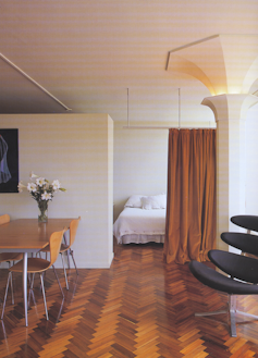
A wall at door height doubles as a cupboard that faces the bedroom side of the divide. Jason Busch/Stanhill Studio renovation by Normam Day&Associates, Architects., Author provided
You could reorganise the apartment to change the functions of the rooms. Think, for instance, are the bedrooms well placed, or should the living areas be relocated?
Generally, external views are best adopted for the daylight hours and so for the living and working areas. And bedrooms rely less on broad outside views.
Melbourne’s heritage Romberg’s Stanhill Building was designed in 1950 with flexible apartment spaces that could be used as residences, offices and medical suites.
Later renovations repurposed the dining and living spaces as smaller bedrooms. The original bedrooms were redesigned as open-plan living and dining spaces, with views to Albert Park Lake.
A studio renovation (see photo above) in the building adopted a storage unit (facing into the bedroom area) to door height, which acts as a screen to divide the nominal “rooms”.
Things that normally work for a single purpose can take on more functions, which aids in using a small space for many purposes. For instance, if you own the apartment, you could replace a normal brick or timber dividing wall with a built-in cupboard which can face, back-to-back, into both rooms.
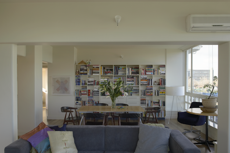
For the apartment renovation in the same building, a storage unit was designed to be a bookshelf taking up most of a wall (below).

A wall can become a storage unit to save space. Trevor Mein/Stanhill Aptartment 2013 Norman Day & Associates., Author provided
Using furniture
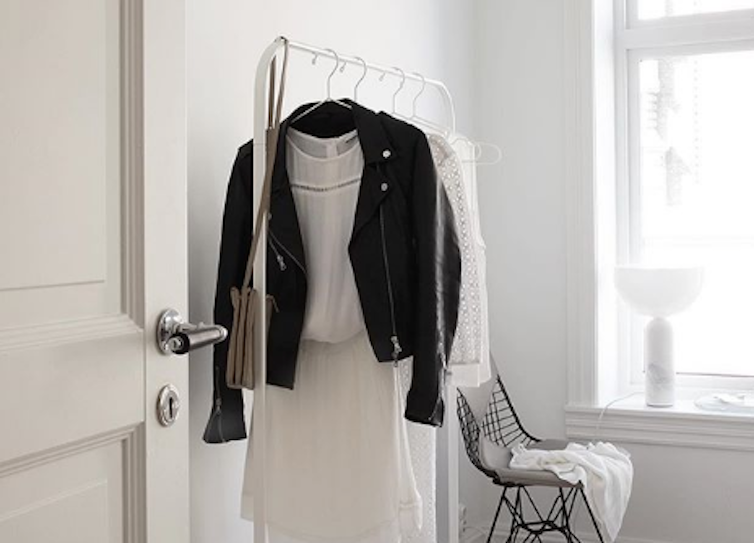
While there is limited research on the perceived spatial dimensions of furniture and its effect, studies do show the more furniture you put into a space, the smaller it appears. And most of us know the less “stuff” we have in our apartments the bigger they seem.
Fitted living room furniture with built-in side tables that hug the wall is better than having large single units and isolated tables. TVs and sound systems incorporated into storage are more space-efficient than stand-alone units.
Big furniture, like settees and coffee tables, ornate bedheads and oversized loose chairs, also overcrowds space. It’s not comfortable to have to walk around large pieces of furniture rather than through space.
The less stuff you have, the more spacious things appear. @elisabeth_heier/Instagram (screenshot)
![]() The best types of furniture to use in small spaces are simple open-framed chairs and tables, furniture with light frames, steel or timber, and open backs.
The best types of furniture to use in small spaces are simple open-framed chairs and tables, furniture with light frames, steel or timber, and open backs.
Kirsten Day, Course Director Interior Architecture, Swinburne University of Technology
This article was originally published on The Conversation. Read the original article.
Main photo: Carol M. Highsmith Archive collection at the Library of Congress.

