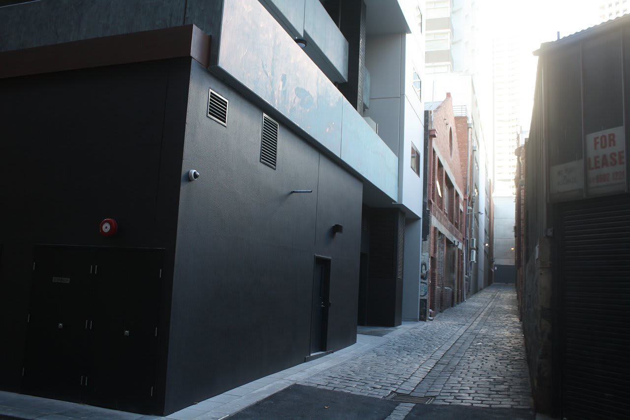
Setting a disturbing precedent
Call this an opinion piece, a policy piece, a design piece, and environment piece... it doesn't particularly matter what category it falls under. What does matter is the completely inept finish and total lack of respect shown to the surrounds in the image above.
For readers unaware, one of Melbourne's unheralded gems can be found mid block and bound by Elizabeth, La Trobe, Queen and Little Lonsdale. This historic red brick warehouse precinct is exemplary and provides a genuine glimpse into Melbourne's past, yet with the most recent incursion of development into the area, concerning signs have emerged that the human scale and character of the area is being eroded.
Broadsheet describes the area's heart, Guildford Lane (symptomatic of the entire area) as follows:
Guildford Lane is a collection of two-story buildings reminiscent of the Melbourne of yore with a sprinkling of the urban contemporary added for good measure. Quaint buildings decorated with haphazard graffiti offer very little indication of visual arts treasures that hide behind their red-brick facade. Towering skyscrapers menace overhead as an ode to the varying layers of history – past and present – that reside there. It’s almost as though some inception-style architect has manufactured the view. Old-world it may be, but it is also fast becoming the nucleus for Melbourne’s visual arts. Here’s a rundown of the galleries you may encounter should you decide to take a trip down this charming side street.
I feel a skerrick of discomfort highlighting the impending plight of this area over others such as The Palace redevelopment or neighbouring Windsor Hotel, yet I do traverse the are quite often; as much a relaxing break from the excesses of the CBD as a shortcut from A to B. Having said that I am pro development so readers may argue an element of hypocrisy is present in this article - regardless this one precast wall has raised my ire, for it may be representative if what is in store.
Let's explore why the monotone precast street level facade located to the rear of the recently finished Melbourne Sky development is totally abysmal. I'd contend development in this area is reasonable given it's bound to the perimeter of the block, leaving the heart of the precinct unblemished - but this is no reason to deliver half-arsed public realm outcomes in such a sensitive area. Externals to both Little Lonsdale and La Trobe are entitled to present in a modern manner, yet the inward facing (particularly street level) facades should respect their surrounds - surely a reasonable assumption?
Not only is there a total lack of respect relative to the immediate surrounds via a black precast wall, there's also total inactivation and a complete lack of imagination - it is in every way disappointing!
So who can be attributed with this blunder? From the outside it seems an abject failure in planning for ultimate responsibility and enforcement lies here. Architects and developers do what they do, yet both local and state planning bodies missed a trick here by not requesting the rear of Melbourne Sky be improved. At the very least a simple wrap of recycled brickwork over the site's precast derriere facing Sutherland Street and McLean Alley would have been a cheap, innocuous outcome that would have at least attempted to meld with its heritage surrounds.
Am I overreacting to this one precast wall - possibly, but consider the four upcoming developments fronting La Trobe Street; Eporo Tower, 321 La Trobe Street, 323 La Trobe Street and Celtic Tower all also back onto the warehouse precinct. Granted early designs for 321 La Trobe Street included an art wall at the sites rear (seen above), but the prospect of having the finer grain of this precinct repeatedly punctuated by average planning and even worst street level facades is evidently very real.
Areas such as this intricate warehouse precinct are not a dime a dozen through Melbourne's CBD and therefore are worthy of respect and much thought when approving new developments within its realm. Based on the initial outcome, it can only get better...
Not familiar with the area? Open the images below to gain a greater understanding of the precinct
