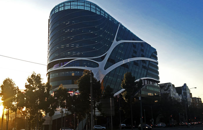
Red+Black review: The VCCC - the new home of Peter Mac
Melbourne’s most important building to be completed in 2016 sits proudly at the top of Elizabeth Street as a beacon of hope to all Victorians fighting cancer.
One of the great success stories in the development of the city of Melbourne is the creation of the flourishing Parkville medical precinct in the early twenty first century. Just to the North of the CBD, with the University of Melbourne as an anchor point, a collection of world class research facilities have sprung up at an astonishing rate.
Bio21 Molecular Science and Biotechnology Institute, the Peter Doherty Institute, the Walter and Eliza Hall Institute and the Melbourne Brain Centre are all now located within the precinct which also boasts the new Royal Children’s Hospital, the Royal Women’s Hospital and the Royal Melbourne Hospital. The crown jewel in this impressive collection is the new home for the Peter MacCallum Cancer Centre which stands proudly as the flagship and gateway to this precinct.
The genesis of this building was from a tender bidding process which was won by the Plenary Health consortium. Embedded within this consortium were STHDI, a joint venture between architects Silver Thomas Hanley and Design Inc, who provided design expertise in laboratory and clinical design. Architects McBride Charles Ryan (MCR) were brought into the consortium to provide their design expertise on the external form and the public areas within the building.
This bidding process set a clear vision for what the project was to be from the very start. A world class clinical treatment, research and education facility all in one building.
The promise that you have made to the State has to be delivered.
Debbie Ryan, McBride Charles Ryan
From the viewpoint of the architects, there can hardly be a more challenging project. A massive site, a $1 billion budget, a huge number of stake holders from multiple organisations and multiple government bodies and the requirement to facilitate cutting edge technology. Yet despite these challenges, a brilliant piece of architecture has been produced.
The first thing you notice about this building, from whichever direction you approach, is the seductive organic expression which willfully sweeps across the facade. The crisp white lines that branch and spread across the glazed envelope intentionally reference the research collaboration and networking ambitions of the centre. Fittingly they also mimic the wiry winter branches of the elm trees surrounding the site.
Along the north edge of the building the facade expression takes on a more sculptural form to present an entry colonnade to Grattan Street. Utilizing finely finished and detailed concrete and fibre reinforced polymer, the building successfully integrates with the busy pedestrian thoroughfare of the street.
Soaring above the observer are two bridge connections between the VCCC and the Royal Melbourne Hospital. These enable the two hospitals to share operating theaters, if the need arises, providing the benefit of additional resilience and efficiency to both hospitals.
Entering the main lobby, or ‘welcome hall’ as it is known, it is clear that the organic theme expressed externally has made it’s way to the interior. The bright and well-proportioned space is generous without overwhelming and disorientating the visitor. Despite being a largely white space, the design successfully navigates the danger of becoming visually sterile. Texture, pattern, and slight splashes of colour are all used with precision.
Moving deeper within the building, the grand central atrium reveals itself, providing an abundant source of natural light throughout the centre of the plan. Vaguely reminiscent of Frank Lloyd Wright’s famous Guggenheim in New York, white ribbons dance around the void to spectacular effect.
Directly below, where one might have expected a staircase or lobby, an open amphitheater space reminds the visitor of the educational role of the building.
Hospitals and laboratories have to meet some of the most stringent design regulations of any building type. With the very specific requirements of Australian and international standards, it might have been expected to notice a convergence in design. Clearly the VCCC has avoided this anonymity. For MCR it was also of substantial importance that the building have a particularly Australian identity. The use of spotted gum timber as an orientating surface within the public spaces subtly makes this differentiation.
As with other major hospitals across the globe, a significant problem is attracting and retaining the best staff. Even though it has only just opened, the VCCC has already lured several world class Australian researchers back to Australia from prestigious international positions. From a research perspective, the building is also a symbol that our State and Federal Governments are taking cancer research seriously.
As well as being a success story for the MCR and STHDI design team, the Victorian Comprehensive Cancer Centre is also a parable for the State Government, on the importance of a strong Government Architect. In procurement models where architecture teams are embedded within an overall project consortium, there is every risk that design quality can be sacrificed for other objectives.
The best protection for the public against these sub standard outcomes is for the State Government client to be provided expert advice. If the government will not accept a reduction in design quality, then the consortium will be forced to deliver on what was promised.
For researchers, the Victorian Comprehensive Cancer Centre is a solid commitment to Australian medical science, in the form of a world class facility. For students and young professionals this building is about supporting the future of cancer treatment. However perhaps most importantly, for patients and their families, this is a building that exudes optimism and hope in a way that only the best architecture can.
Michael Smith is a principal at Ateiler Red+Black. This article originally appeared on the Red and Black architect blog.
